Posted by Shane Becker on
Previously on IndieWebCamp Logo Redesign
I’ve been in the process of redesigning the IndieWebCamp logo. The last round of iterations ended with this version which had an admittedly not the best C in the logomark.

No new attention has been paid to the logotype. Ignore that for now.
Iterations of Rounded C Knockout
Based on suggestions from the #IndieWebCamp IRC channel, I worked on rounding off the knockout in the C.

Original version with rectangle and square corners knockout

Iteration with rectangle and rounded corners knockout

Iteration with pill shape knockout

Iteration with taller pill shape knockout

Iteration with longer pill shape knockout
I felt like this read more like a C. It’s pretty fun, kind of looks like a racecar drive / astronaut helmet. And it’s pretty evenly balanced within itself and within the whole logomark. So at this point, I made the one color and three color versions.

Tennis ball iterations

Tennis ball iterations

Tennis ball iterations
But after a while, it started feeling like a tennis ball. I got some more feedback from the #IndieWebCamp IRC channel which led me down the path of using just a single cut for the knock out.
Iterations of Thin C Knockout
Here are four slightly different variations of the same idea. Rounded vs square. Half vs three quarters width.

Iterations with single cut knockout

Iterations with single cut knockout

Iterations with single cut knockout

Iterations with single cut knockout
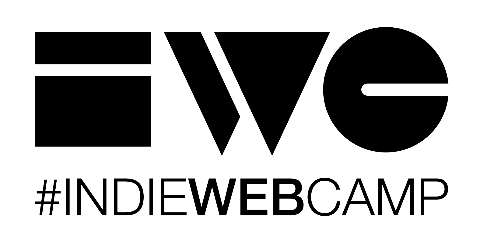
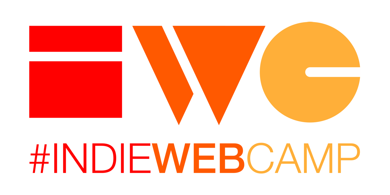
The third one resonated best with the group. I like it too. So, I made the outlines and three color version as well.
Final IndieWebCamp Logomark Redesign With Thin C Knockout

Final (?) proposed IndieWebCamp logomark redesign

Final (?) proposed IndieWebCamp logomark redesign

Final (?) proposed IndieWebCamp logomark redesign
If these versions are well accepted by the group, the next step is really nail down the logotype. Which is currently fine, but not that great.
Again, direct any converation about this over to the IndieWebCamp wiki’s /logo page.